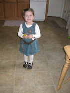
People...you may or may NOT have noticed...but I've gone all banoodles and got meself a WHOLE new background, faunt, colors, pics, everything. And, I did it all by myself. Aren't you proud? Well I am, this is big doins in these parts. All I'm saying is, YOU BETTER tell me what you think. I spent a whole 1/2 hour doing it dammit, and I want responses. Ok fine, it was more like 45 minutes, I'm just sayin. But for reallys, WHAT do you think? Likey? No likey? Stupid? Fabulous? Shoot, I'm just so proud to have a picture in my header, I feel so 2009 now. hehehe
Backgrounds and back pats (get it?)
Allyson
Hey, It's Okay
1 day ago


15 comments:
Very cute! I know, don't you feel so computer savvy now? When I first did my blog I told Dennon I was a webmaster or something dorky like that because I was so proud of myself.
I wish I knew how to move the text in the header, though, so it wasn't over Jere's face. I have that problem a lot too, and end up changing or cropping the picture, shrinking the font size, etc, to try to fix it. But it would be nice if I knew how to just move it to the bottom or something.
But it looks great! Good job! I need to get around to changing mine from Christmas. . .
Love it! If you go into customize, then fonts and titles, then blog title font, you can click on smaller or larger or change the font. The window at the bottom of that window will show a preview of the new font and how it looks.
I think it's fabulous! Don't get too crazy, now, because then you'll become obsessed. Like me!
Thanks for covering my entire face. Ha! Guess I see where I stand in the big picture of things.
I find it deliciously delightful! Oh and the family pic is super adorable. It, and you, rock!
Okay don't think I'm a blog stalker or anything - the link was on your facbook page. ;)
Love the background and your layout. Totally cool that you can do this all on your own. I have to bribe family and friends every time I want a blog facelift!
Heather
way to go! Definitely an improvement over the old.... part of the background covers some of the text at times for me... since i have a small screen, but, I can work around that :)
Lookin' pretty good! This blogging stuff does suck up time, doesn't it?
FI-NAL-LY!
LURV IT!
Jere is right about covering his face though, send me your picture and I will fix it so the words are on the bottom.
cfischbeck@cox.net
Very nice work my friend!!!!
Looks great, Al!
Super, super cute! Sorry its 1am, so thats about all my brain can give ya. :) No clever comments tonight.
I hate you. Nah, I love you. I am going to kife it now.
P.S. The ghetto way of removing the words out of Jere's face is to put the words on the picture (gif/Jpg) itself before you upload it onto your page. Use what ever graphics program you have. Then have the title for your page but keep it hidden from view. I think it could work.
WAY CUTE! And go you! All by yourself. I'm still a scardy cat when it comes to doing anything with technology!!! I'm afraid I'll mess everything up! Someday -- maybe. Anyway, love it.
cute. 'cept the words all over jere's face. other than that, very very cute. i'm so proud!!!
Post a Comment